This post comes to you from Florida, written on my vacation here. The day was a relaxed one, spent walking and touring St. Augustine at our own pace, with a certain black and white striped tower still to come. That is a story for the next post. For now, let’s revel in this beautiful stamp:
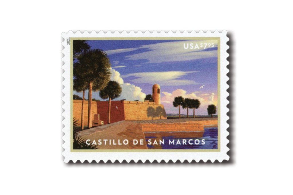
I bought this stamp before we travelled to Florida. I liked the art style, and I knew we would be visiting the fort it shows. Today we did, at the Castillo de San Marcos in St. Augustine.
The stamp is a $7.95 Priority Mail issue from January 2021, and the first day of issue was in St. Augustine. The art is a digital illustration by Dan Cosgrove, based on a modern photograph of the fort’s northeast corner. So the artist started from a photo too, and I went looking for the same view.
I spent a while walking around the corner of the fort, trying to line up the tower, the palms and the wall. This is the closest I got. Drag the handle to compare.
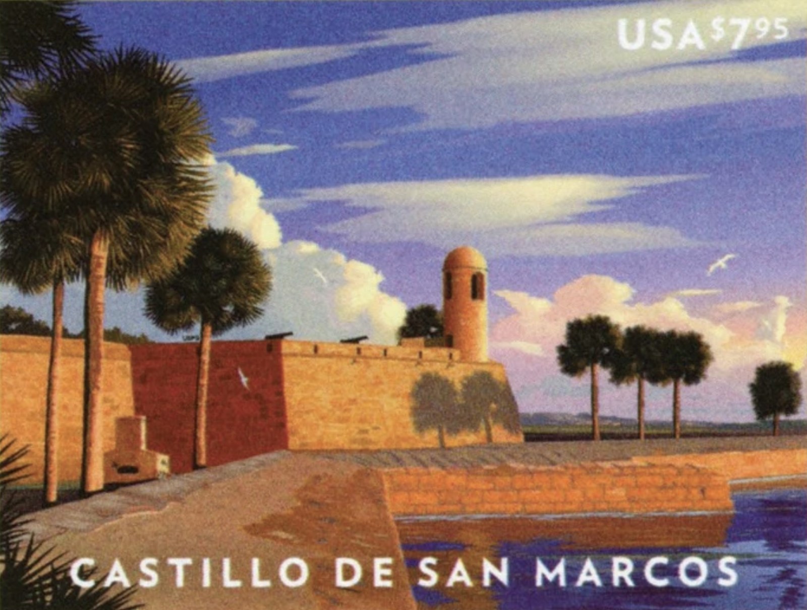
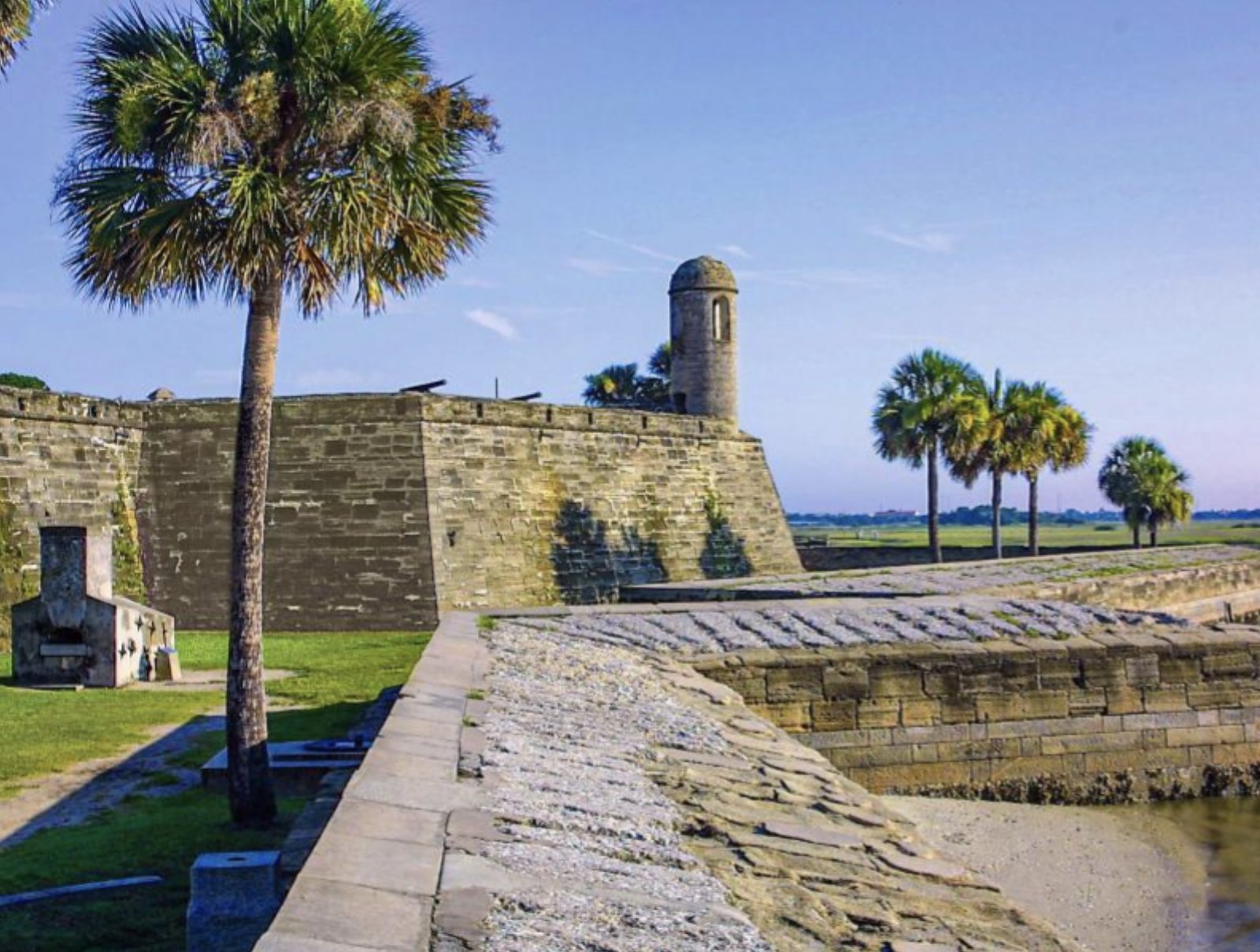
It is not a perfect match. The tower and the row of palms on the right line up better than I expected, but the cluster of palms on the left does not, and I never found a spot that gave me that many. The artist was also generous with colour. The stone on the stamp is warm orange, with one section of wall a deep red, while the coquina in my photo is grey. He added gulls as well.
The Castillo is the oldest masonry fort in the continental United States. It took 23 years to build and is made of coquina, a soft stone of compacted shell. It served as a military site for over 250 years before it was deactivated in 1933. The Americans called it Fort Marion until 1942, when Congress restored the Spanish name.
The detail that caught my eye is the small stone structure at the foot of the wall on the left. It is in my photo and it is on the stamp. Here the artist pretty much nailed the like-for-like image.
I did not get the perfect match, and I have decided that is fine. The stamp is a better picture than my photo, and my photo is a better record of where I stood.
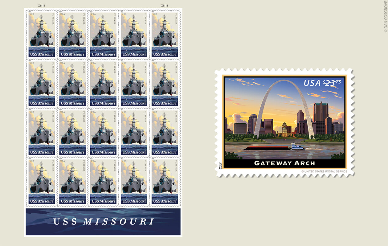
More Stamps by Dan Cosgrove
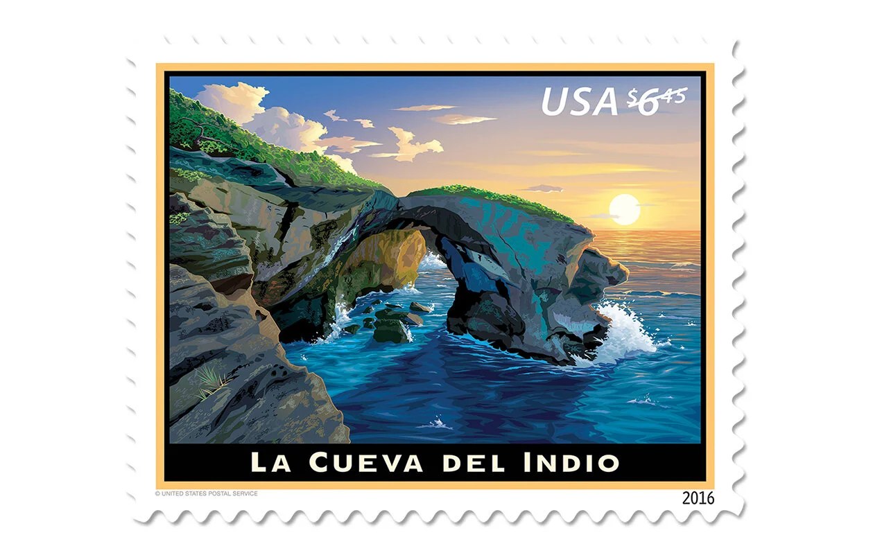
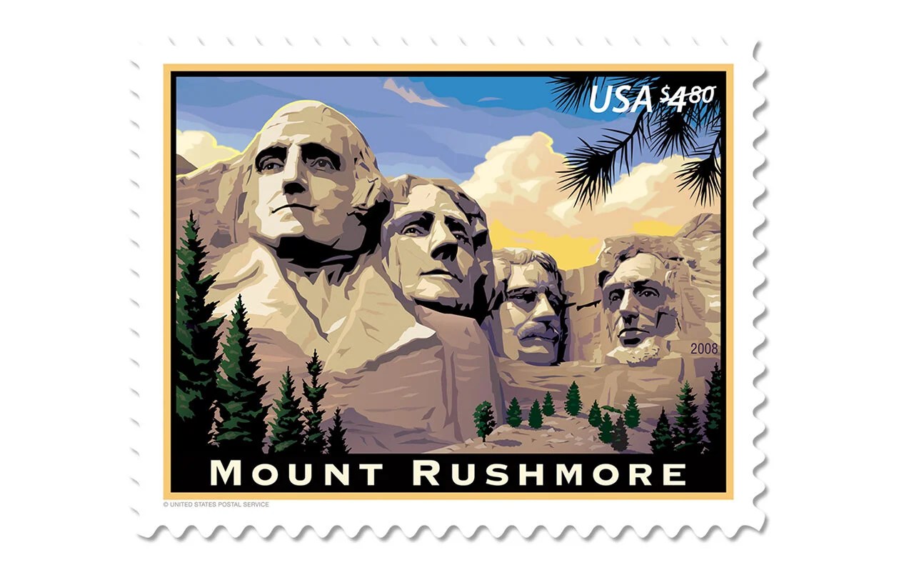
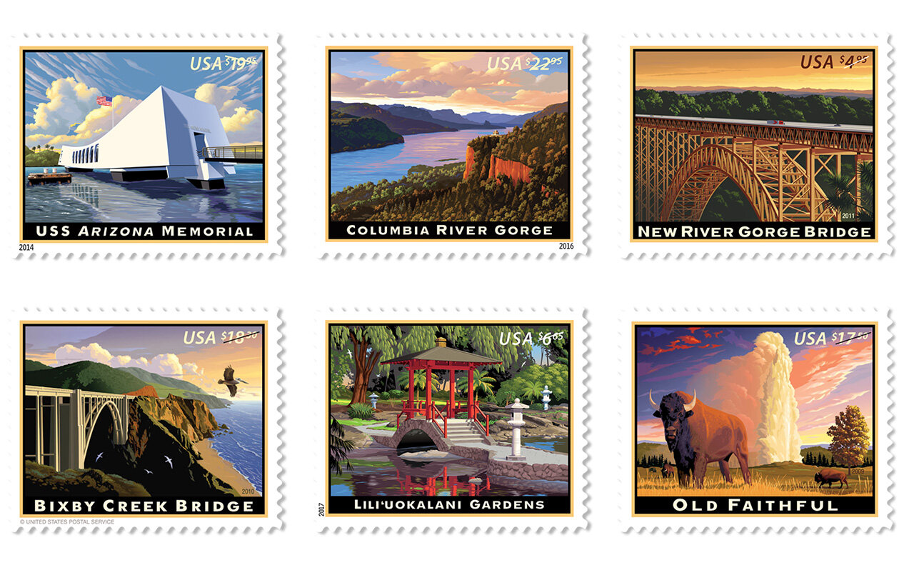
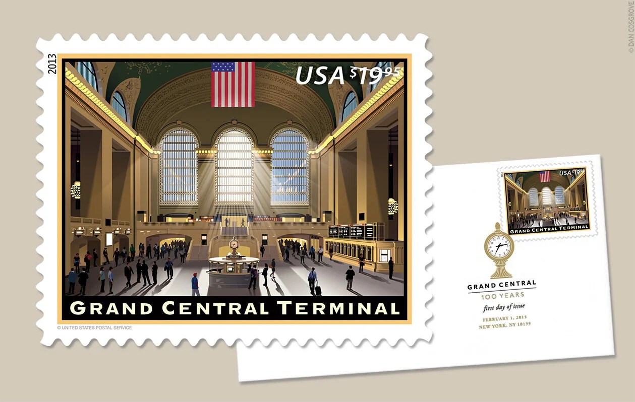
I love Dan Cosgrove’s style. The bold colours and strong light give each of his stamps a sense of place, like a small travel poster. He has illustrated many other stamps for the United States Postal Service, and you can see them on his projects page. Here are some of them.



Leave a Reply